Editing my Promotional Poster
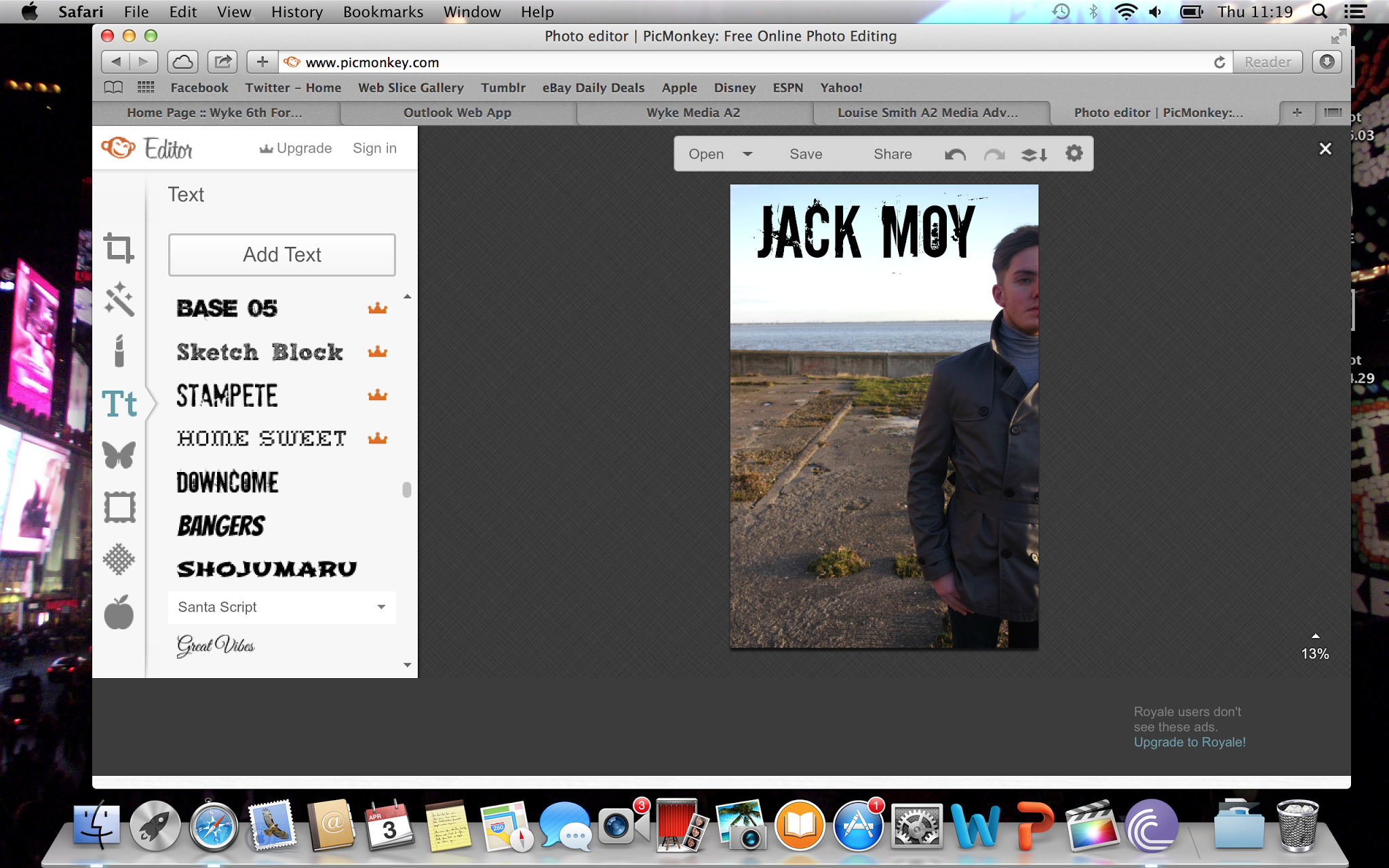
I begun my poster by adding fonts that I felt followed the conventions of my genre, therefore I use 'Downcome' for my artists name as it is not your plain, boring font but catches your eye due to its edginess and indie look.

After adding the text and increasing the brightness a little, I added the image of my album cover to the poster and placed it in the bottom right hand corner next to the website.
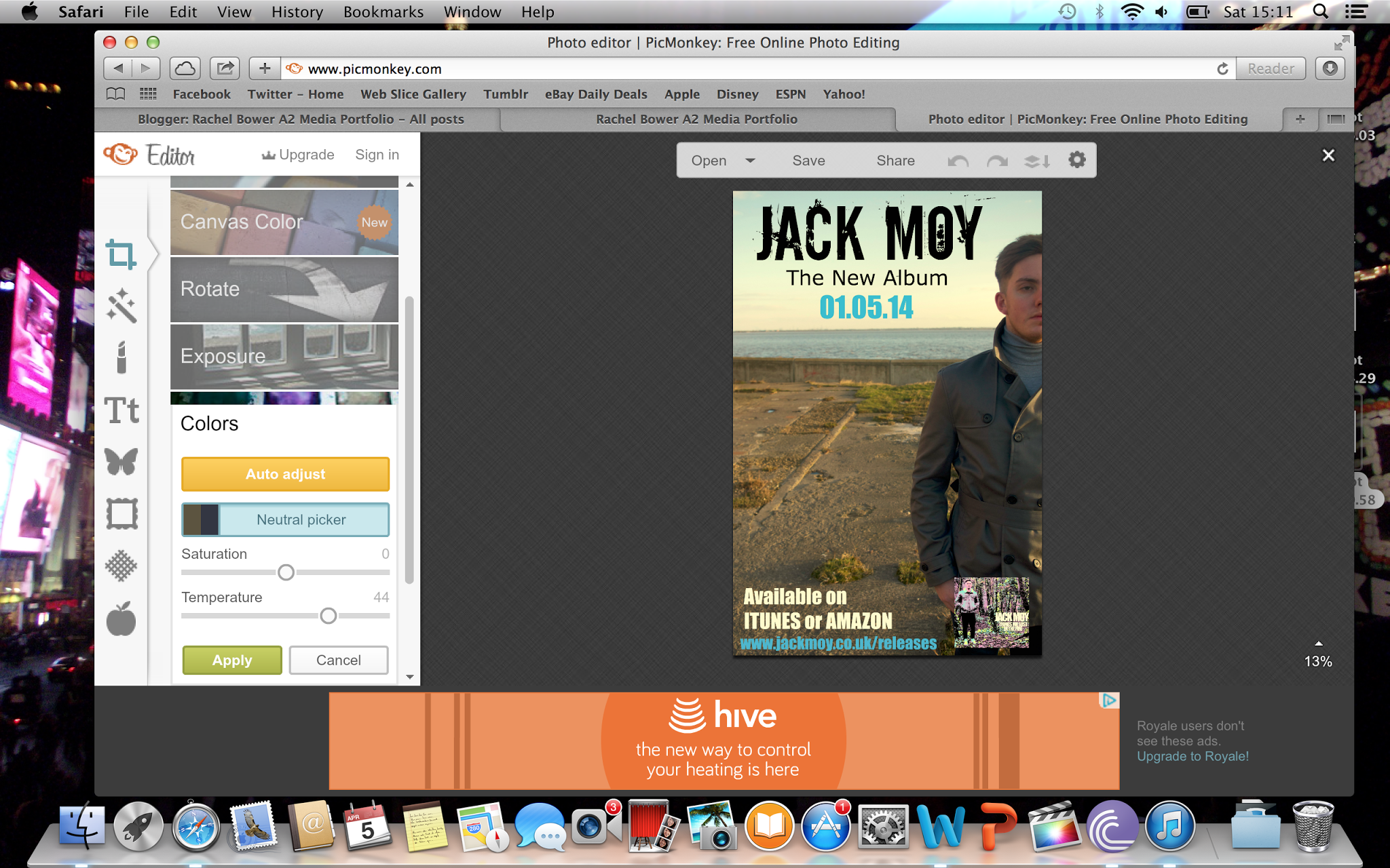
I then went on to editing the colours of my image through the 'Neutral Picker' this let me play about with the saturation and the temperature of the image, which allowed me to make the image a tad brighter but adding a slight brown/yellow old look to the picture.
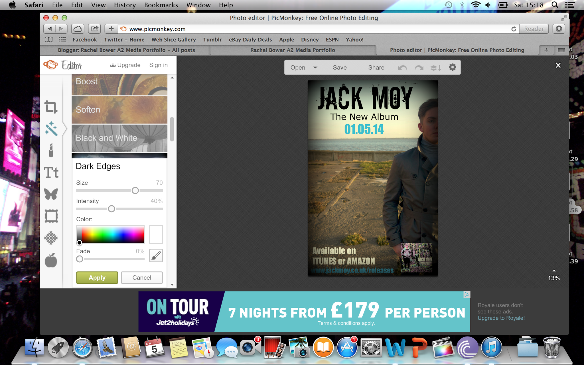
I then added some dark edges around the poster to make the text stand out more situated in the middle of the poster.

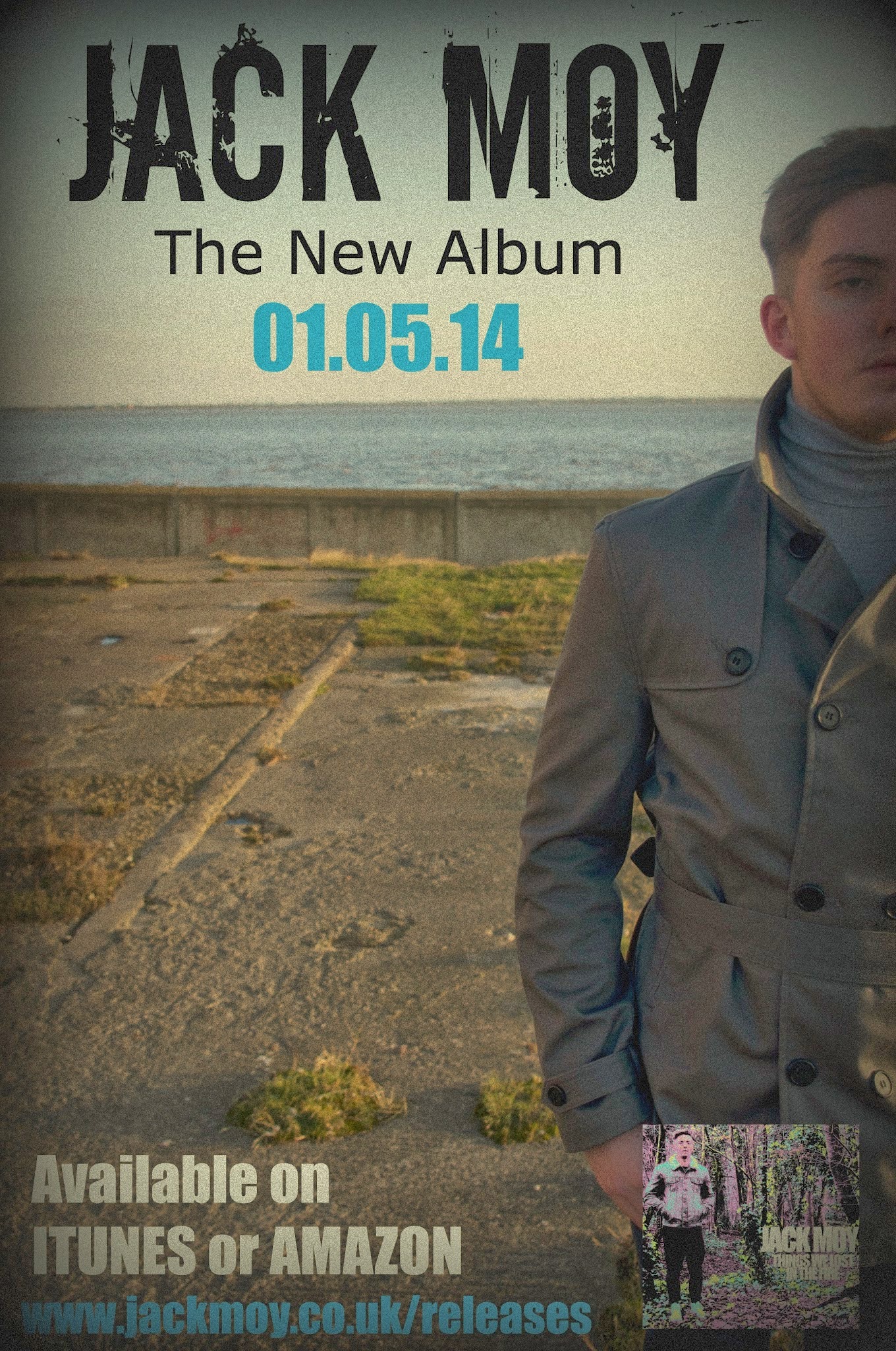
I then added a 'Film Grain' effect to my poster as I felt this had continuity from my music video. I used the film grain effect when using the camcorder within my filming. I felt this fit the genre very well and I like how the running theme of film came from my video to the poster.
Third Draft of Promotional Poster
No comments:
Post a Comment